
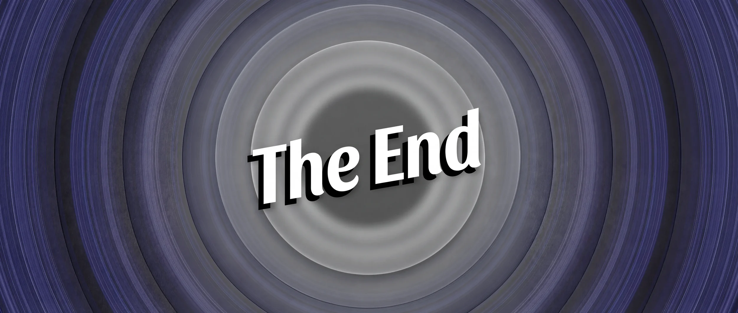
Spectrum
Visualizing the Color Palettes of Films
Context
This is a personal project focused on visualizing the color palette of an entire film in a single image—a data visualization idea that has turned into a full-fledged artwork side gig and a viral format for representing color.
My role
Creator, Developer
Team
Personal Project
Timeline
Development: 2015
Selling Prints: Ongoing
Tools
Processing (Java), Photoshop

Color choices and grading do a surprising amount of emotional heavy lifting in film. The warmth or coolness of a scene, or the repeating of a certain color throughout a movie can tell a powerful story on its own. Many directors have distinct approaches to color in films—Wes Anderson’s high saturation pastels creating storybook-like worlds, David Fincher’s cold steely colors creating a bleak backdrop, and Kubrick’s sharp contrast and sudden bursts of color making for chaotic unpredictability. Color choices set a distinct tone for a movie.
I had seen a lot of visualizations of color breakdowns, but most of these only visualized single frames. This only tells a tiny slice of the story, and misses the full picture of color choices across an entire film.
The Goal: How could I represent the color palette of not just one frame, but an entire movie?
What I hadn’t seen well shown before was the color arc of an entire movie, and how it evolves over time from the first frame to the last. Spectrum was made to capture that full emotional progression of a movie in one continuous visual expression, and as something that feels more like artwork than a technical analysis.
DEVELOPMENT
I was taking a coding class learning Processing for data visualization, while another film class had me thinking about colors in movies. I figured I could combine these interests and try to visualize film colors in a brand new way.

What is the quintessential color of a frame?
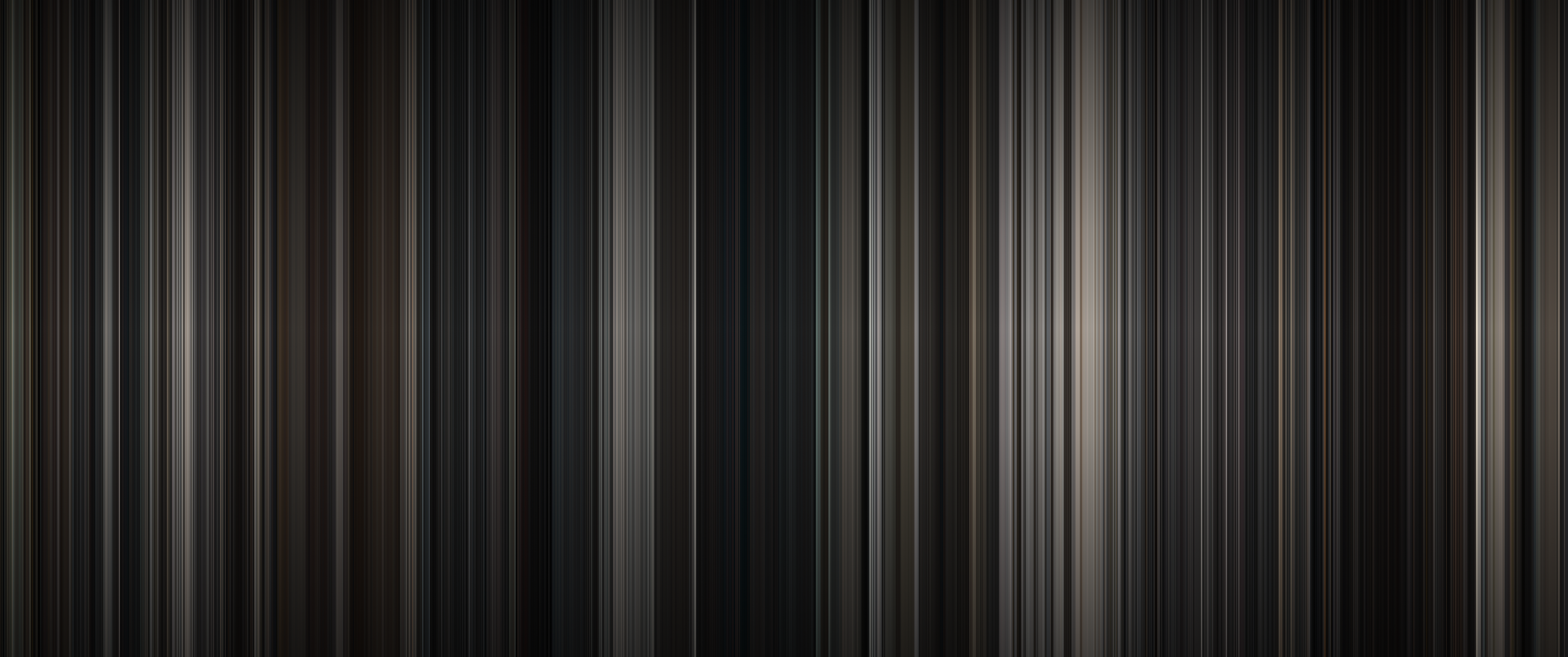
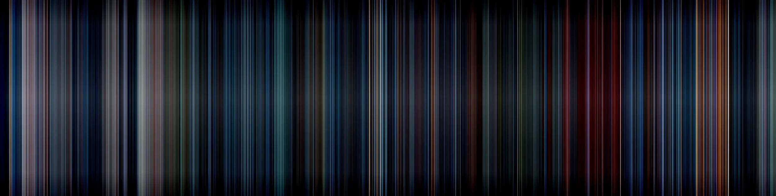
I started out with a process known as a barcode effect. Basically, you take each frame, and squish that frame into a single vertical line, and repeat over and over.

Put those lines in sequence all together, and movies look something like this:
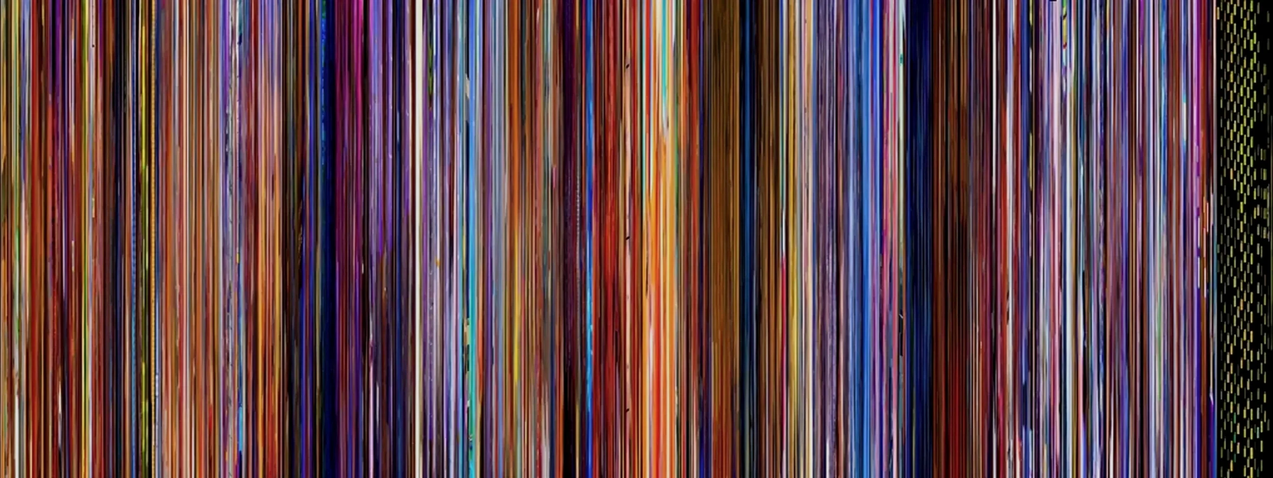
This produced a fun effect, but the variation from top to bottom in each line made for a really messy end product. I wanted something that felt more precise and cut out the noise, by having each line be a solid, single color.
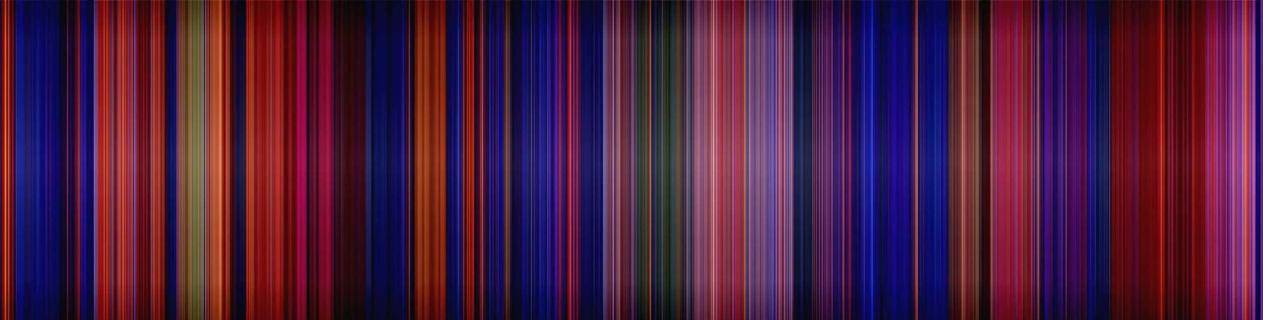
To instead get the average color of each frame, I landed on simply sampling the R G and B values of each pixel, adding each into a running counter, and dividing each number by the amount of pixels per frame. That gives me a single RGB code per frame that represents the exact mathematical average of every pixel.

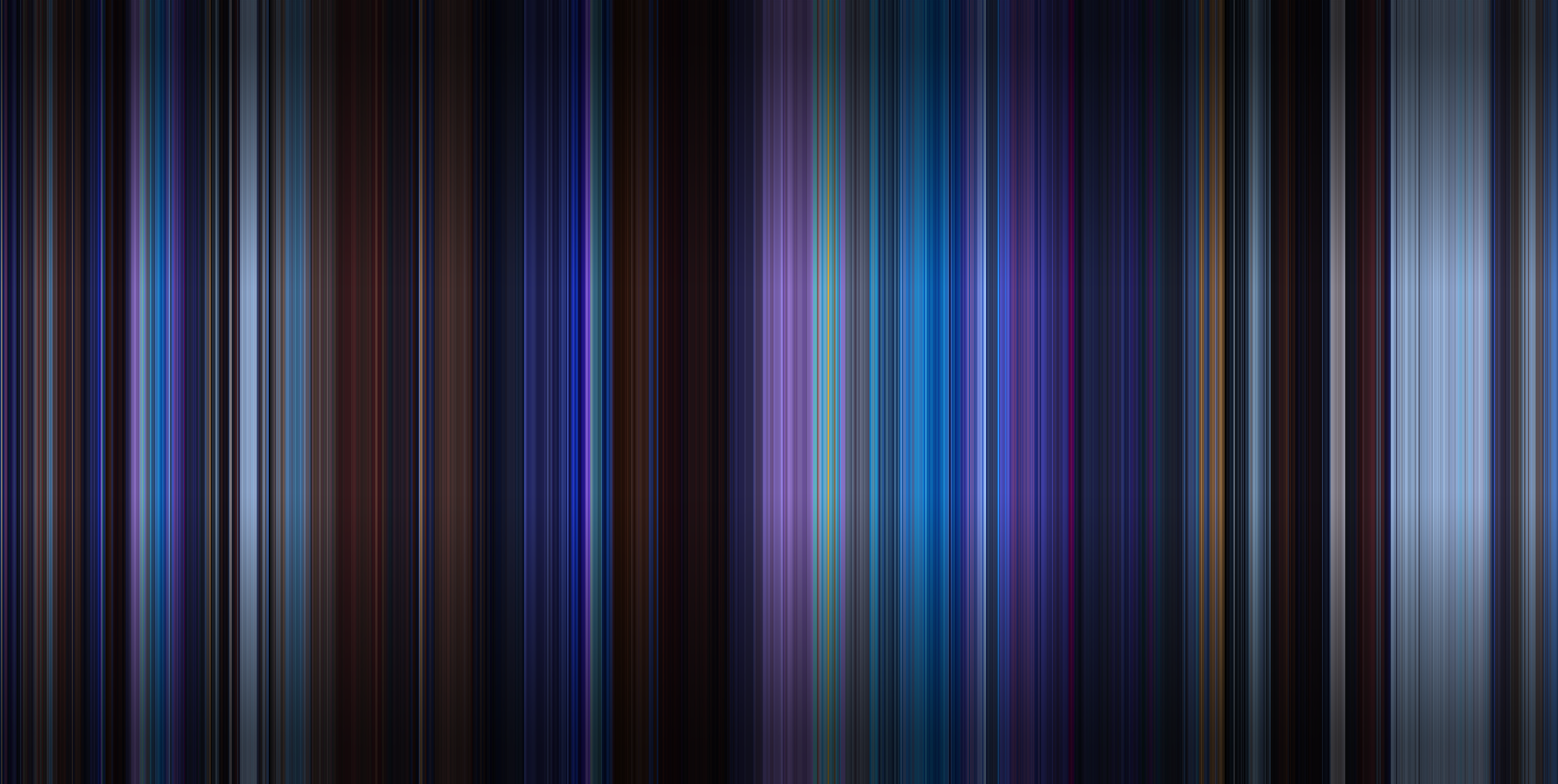
Now each line is a solid color that represents the overall palette of the frame. Do it for a whole movie and you get effects like this:
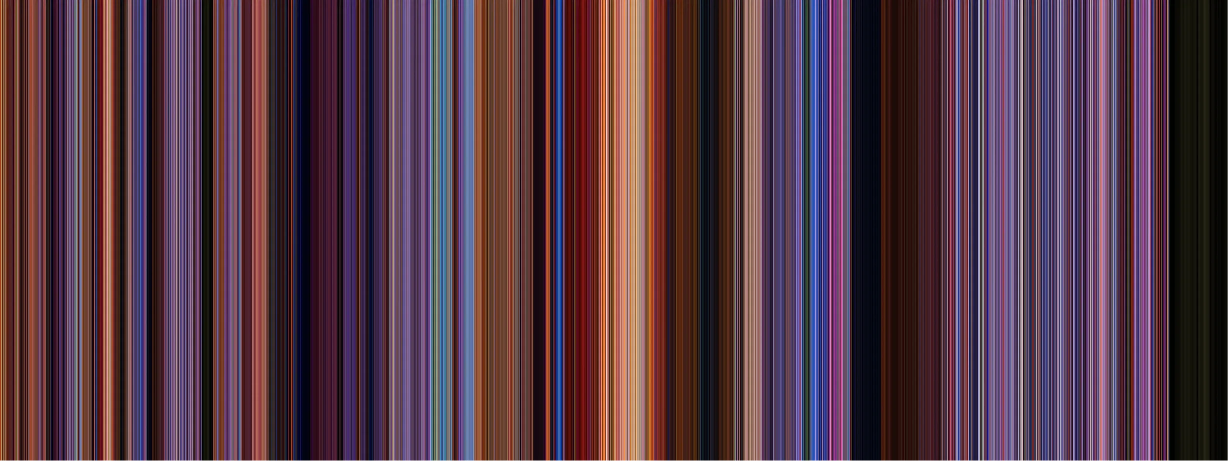
I loved this look. Although it’s more simplified than the previous “squish” approach, it focuses in more on color and nothing else, making for a much cleaner result.
What really surprised me is I expected the average to be a soupy greyish brown for most frames. You’d think that taking every pixel into account, would average into a mushy gross brown. But that itself was a testament to the goal of this project—directors carefully curate the color palette of every frame, often times having a clear dominant color on-screen that carries the average.
Here’s what my program looks like as it’s creating a Spectrum:
This is playing at 1x speed just for demonstration, but I can bump it up to 50x speed to run through a feature length film in just a couple minutes.
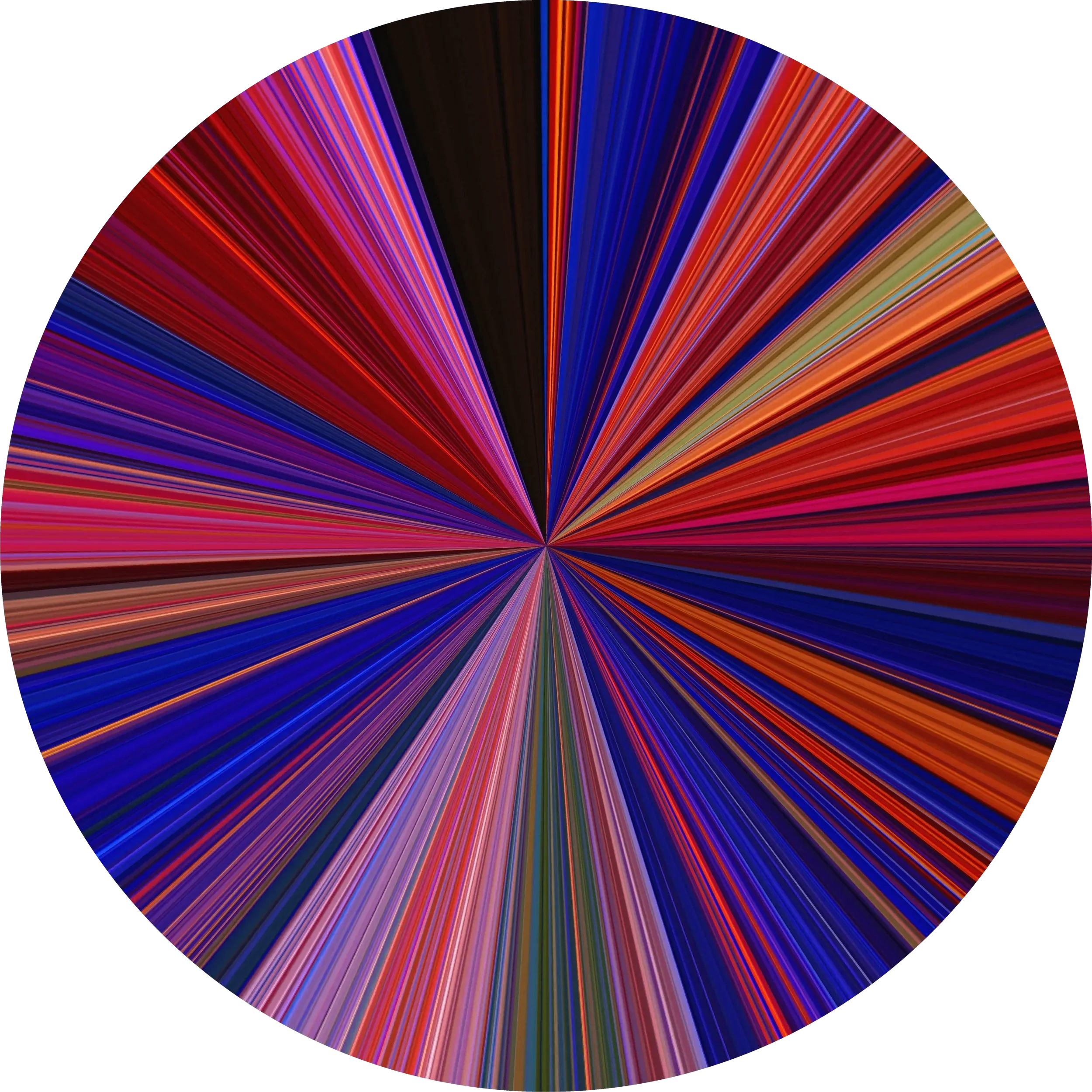
I tried other visualizations like a concentric “record” style and a radial sweep, but it wasn’t immediately obvious which direction was the beginning and which was the end.
They look neat, for sure, but it’s much harder to tell where a certain section is in the timeline of the film, and in the concentric one, the larger circles dominate the end product more than they’re represented in the movie. Cool art, but not great for actual analysis.
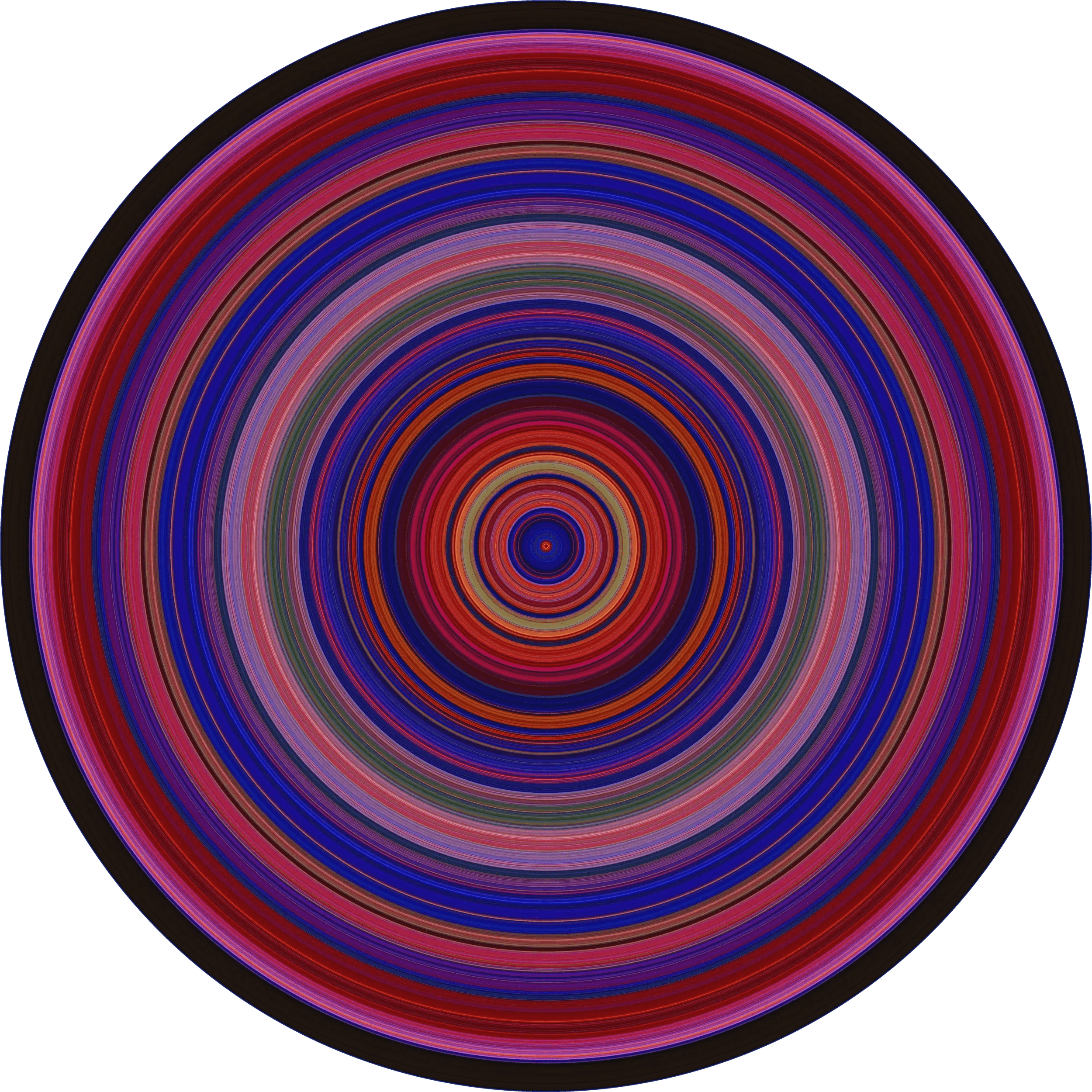
I stuck with the horizontal approach. We’re used to reading left-to-right. It hits my goal of being an unmistakable indication of time without needing explanation.
While I didn’t want to mess with the colors at all, I found that this being a series of vertical lines made it hard to glide your eyes left and right across the image. Try it below - notice how your eyes get a bit stuck on sections moving across it rather than smoothly scanning it.

To add some horizontal leading lines, I added a subtle darkening gradient to the top and bottom to give a bit of depth, and create a subtle ribbon effect across the center of the image that your eyes are drawn towards. I found this added a more cinematic effect and gave some needed left/right blending to the piece. I was careful to preserve the true color of each frame at the middle of the image.
RESULTS
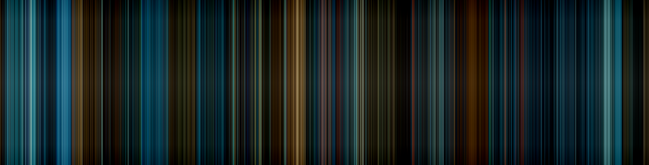
Here’s a few of my favorite Spectrums. Notice the difference in color usages—some directors tend towards cohesive palettes and dominant colors throughout a piece (The Matrix, Mad Max, Wes Anderson’s Moonrise Kingdom & Grand Budapest Hotel), some use color to reinforce location changes (Star Wars, WALL-E), and some use a huge range of contrasting colors to always keep viewers on their toes (2001 Space Odyssey).
I’ll save us both the full dissertation, but it’s fun to observe how each movie’s colors reinforce its themes.


IMPACT
I was proud of this, so I thought hey, why not, I’ll make a lil Reddit post about it with a few examples. That post quickly became the top post that day on all of Reddit, which led to a ton of engagement and people asking for custom pieces in the comments! I also got a lot of helpful feedback on how to improve the visualizations and optimize the code a bit more.
This was super fun for me, knowing that this lil personal project had also piqued the interest of so many other people out there.


Once it gained traction on Reddit, I got contacted by a few papers writing short pieces on it, which really kicked up the traffic for a while. My email was flooded with custom requests and responses, I was pretty overwhelmed with the responses!


I had several notable requests for prints of custom pieces. This one was with interior design firm Squarehouse Studios to create a large canvas for one of their clients’ house redesigns, featuring their favorite movie (a black and white film, which has a neat effect, albeit not my favorite).

A few college courses and textbooks now use this project in their curriculums—including a 400‑level CSE class at UW—which is hilarious to me because I went to UW, made it to CSE 143, and then noped out of that entire computer science program in favor of UX design.

I quickly acted on all the positive engagment and set up a business page to print custom art pieces for folks - frames, canvas, metal prints, etc. I’ve made hundreds of these for people ever since, all originating from requests of their favorite movies, and it’s been a super fun side gig! It’s extremely gratifying to know that something I made is hanging up in houses all over the world.
This also spawned a HUGE amount of copycats out there selling near identical works. I can’t copyright or patent the process (believe me I looked into it), and at this point I don’t mind. It’s cool to see that the idea has resonated with so many folks out there—that’s enough for me.

Look, this isn’t a traditional UX project—there’s no interactive systems for customers to use. But data visualization is an interface, even in an artistic context, and it certainly relied on my same UX problem solving process: creating a goal of visualizing color in movies both clearly and delightfully, researching existing methods to find opportunity gaps, diving deep to create my own solution from scratch, and refining it based on customer feedback to end up with an end product that many people have resonated with. That’s UX for ya!
Immersive Shoppable Spaces
A 0-to-1 launched feature I led design on that reimagined discovery and inspiration on Amazon.
Rendering Photoreal Products
A deep dive I took into the technical deets to overhaul the realism of all 3D products on Amazon.


AI & Conversational UI in Augmented Reality
Overhauling Amazon's View in Your Room feature with spatial AI and natural language UI.

Accessibility & Physical Prototyping
A functional Braille communication prototype i built from scratch for visually impaired gamers.


VR Northstar Design
A high-fidelity VR home shopping interactive demo I spearheaded design on.