Amazon Beyond
Inspiring Customers with Virtual Shoppable Spaces
My role
Sole Designer, 0 to 1
Team
Amazon Beyond
13 Devs, 6 Interior Designers, 3 3D Artists
Timeline
2022-2024
Tools
Figma, Adobe CC, Unity,
Maya & Blender, Babylon.js

Context
Amazon Beyond is a transformative new way to shop, putting customers in immersive 3D spaces full of buyable products and inspiring ideas.
We created this whole feature and technology from scratch to launch over a couple years, released nearly 100 shoppable spaces to customers, and found strong success in conversion rates, basket building, and dwell times (40 seconds on average spent in a space, vs 8 seconds for other immersive experiences on Amazon).
The Goal: Make Amazon better at discovery and inspiration.
People mainly use Amazon when they have a specific item in mind, not really to browse or spark ideas. An overwhelmingly large catalog, untrustworthy no-name brands, and a lack of inspiring lifestyle imagery makes it tough for customers to browse Amazon for broad searches. We wanted to fix that.
With our team’s 3D background, we believed immersive shoppable spaces could change that – creating spaces designed for window shopping and discovery, showcasing curated sets of products, and giving both high‑end brands and small brick‑and‑mortar shops an immersive way to tell a story on Amazon.
My Contribution
I was the sole designer from day 1 to launch, wearing many hats on a startup-like team. I drove user advocacy end‑to‑end: in ideation, roadmap planning, prototyping, user studies, UI design, CSS tuning, brand executive sales pitches, internal tooling, and defining 3D UI cross-team standards at Amazon. I consistently pushed beyond a traditional UXD role to uphold a high quality bar across development.
I left the Beyond team in late 2024, so while the live experience may have changed a bit, everything here is from my time as the design owner.
RESEARCH


Not Good: Detached Aesthetics
Why would I buy a camera in a virtual bouncy house? Why would I buy Beats headphones in a coral reef? These fantasy spaces seem fun to explore, but the products feel cheapened and out of place, and shopping is the least fun part of the experience.
Competitive Analysis
I ran user studies on similar immersive experiences and saw major shoppability gaps Amazon was uniquely positioned to solve. I’ve summarized those opportunities into 3 goals:
Focus on shopping, not gimmicks.
Virtual spaces can be delightful, but it’s easy to lose sight of why customers are here: shopping. Many competitors lean into whimsy at the cost of shoppability. I focused on adding delight that supports the shopping experience, and never detracts from it.
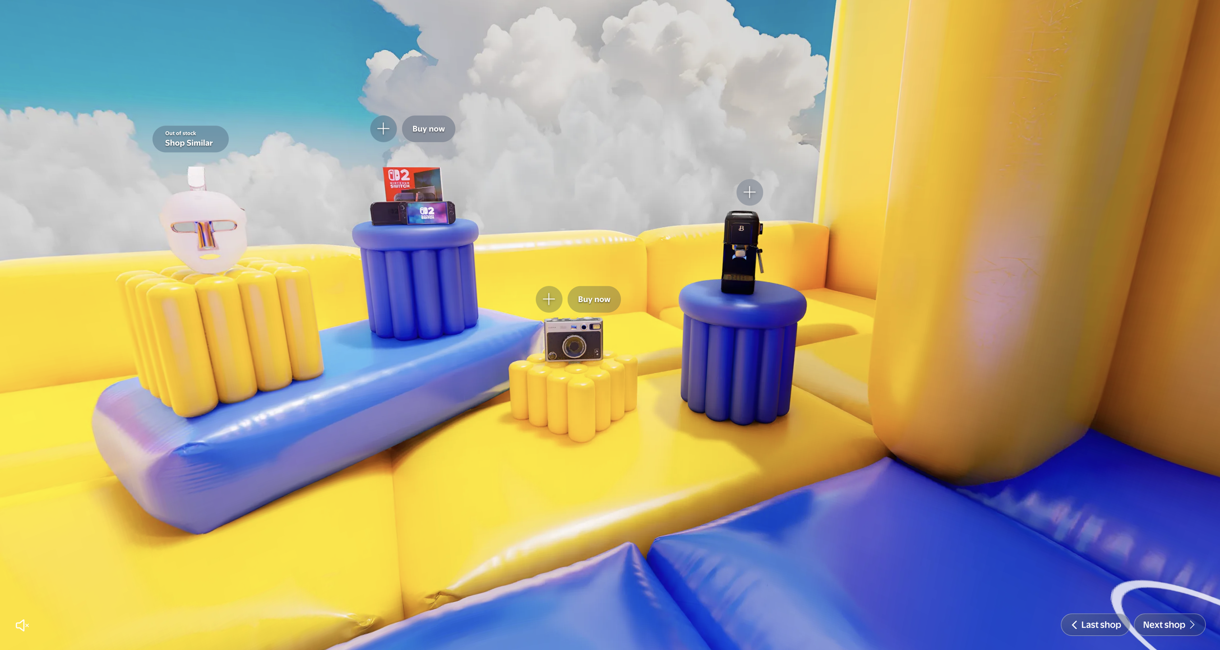
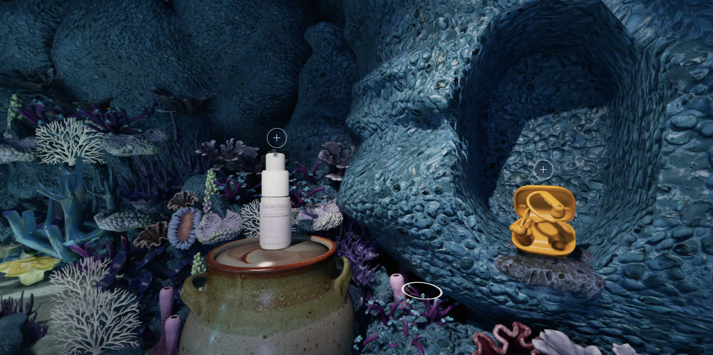
Not Good: Detached Aesthetics
Why would I buy a camera in a virtual bouncy house? Why would I buy Beats headphones in a coral reef? These fantasy spaces seem fun to explore, but the products feel cheapened and out of place, and shopping is the least fun part of the experience.
Use smooth motion for easy navigation.
Apps with smoothly blended movement consistently outperformed ones without, resulting in far more time spent in a space and far better sentiments of the experience.
Not Good: Jerky Motion
Jump cuts to each new angle disoriented users. Re-finding your bearings each time you'd move was hard enough that most participants only moved a couple times before bailing.
Good: Smooth Motion
Experiences with smooth motion increased dwell time considerably by giving customers a clearer sense of the store layout and a more delightful walk‑through experience.
Make something people would use again and again.
My dusty Quest 2 VR headset will tell you: novelty wears off fast. A lot of fancy tech demos impress once, then get forgotten because they’re clunky or burdensome. Many shoppable spaces felt the same: fun once, but not something you’d choose over normal shopping.
We aimed to build something with real value and effortless usability so customers would actually return to it for real shopping missions.

Not Good: Boring Displays, Boring Products
Navigating a 3D scene just to look at flat shelves doesn't take advantage of the uniqueness of this experience. The products aren't in inspiring settings or worth seeing from multiple angles. This is 10x harder to use than a grid of search results, and with no clear benefit.

Not Good: Overwhelming Spaces
This is a decadent beautiful space, but there's so much set dressing in here that products fade into the decor. It's a bit exhausting to find products since there's so much to look at, and while the space is great, the shopping gets muddled.
With these findings and more in our back pocket, we were ready to build our own platform for shoppable 3D spaces.

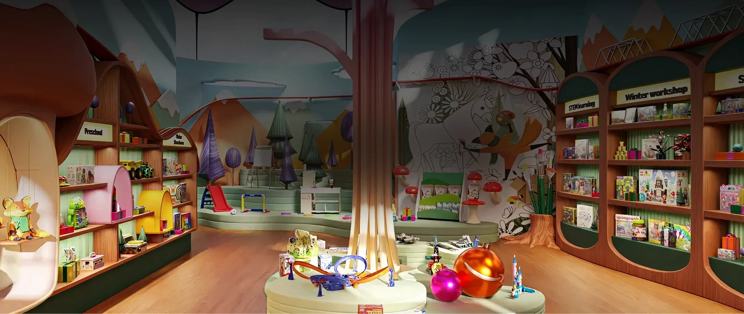
MAKING 3D SPACES
I pride myself on being involved in every aspect of a project’s development, not just being the UI guy. The 3D spaces we created were as important to the UX as any UI or shopping features – so I was closely involved in planning out 3D spaces, testing render methods, and advocating for a high quality bar along the way. So before getting into the UI, let’s talk about how we made these spaces.

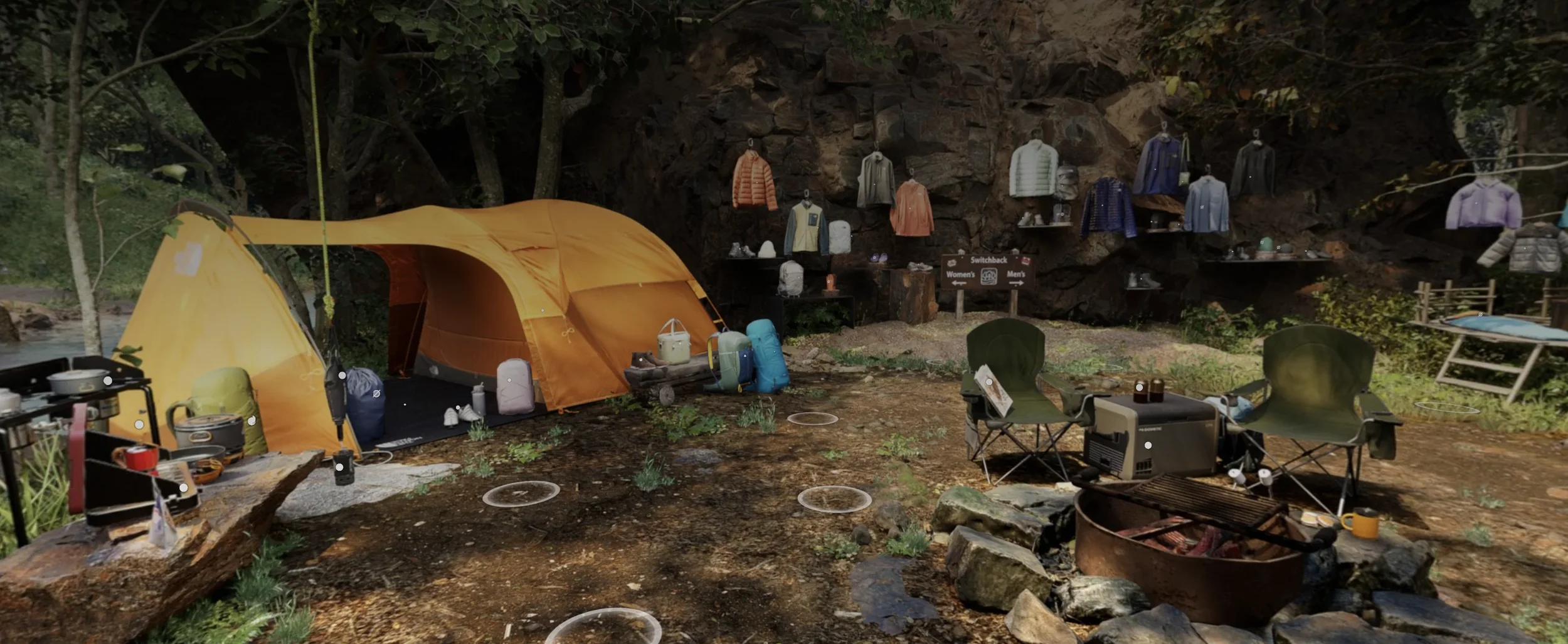
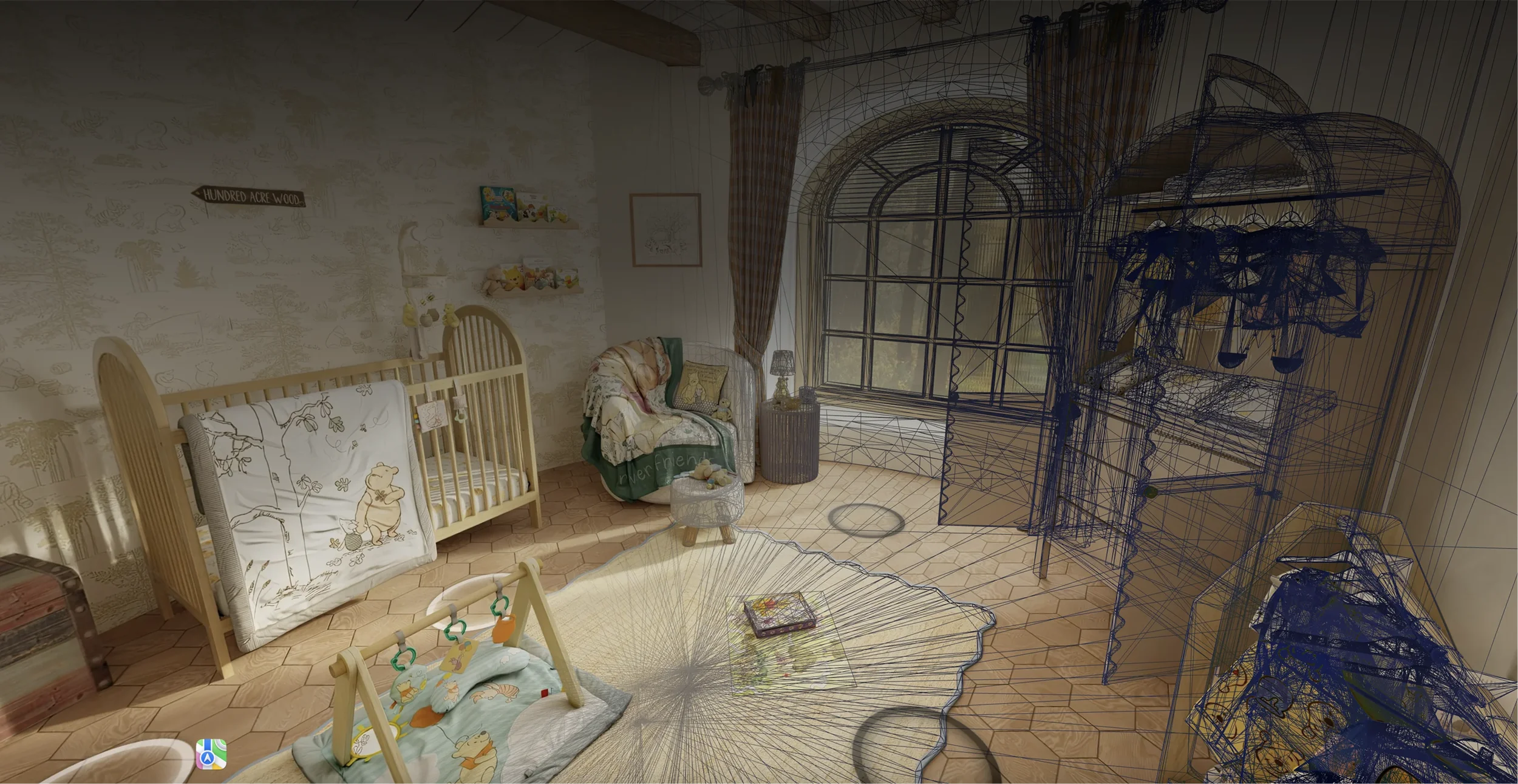
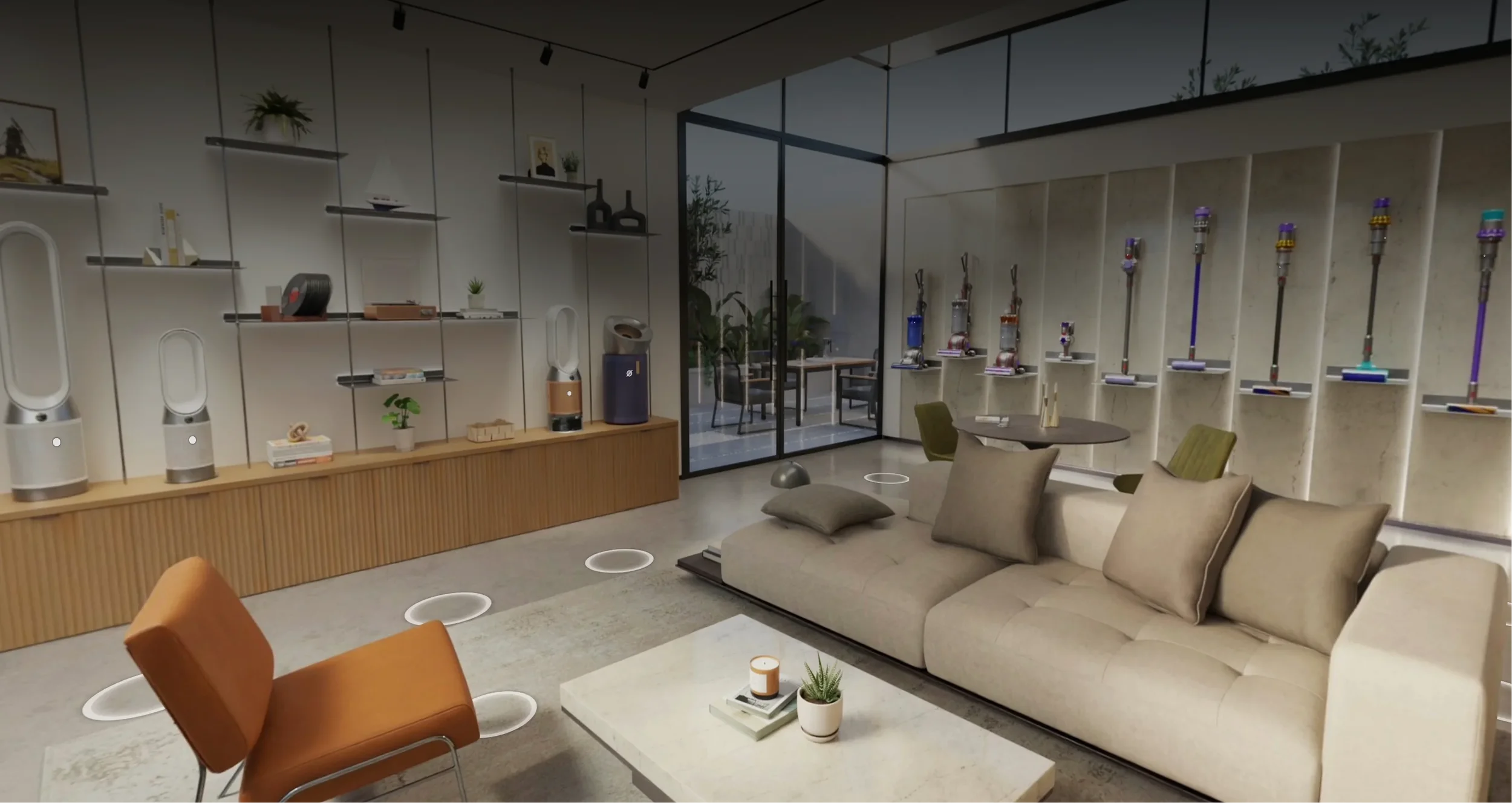
Amazon Beyond works with two types of scenes: real-life spaces scanned with cameras, and completely virtual spaces modeled from scratch.

Real Spaces: Photographed
Many of our initial showrooms were real-life spaces - showrooms, stores, and influencer spaces that show products in natural, inspiring contexts. We photographed these spaces with special cameras and reconstructed them in 3D.

Virtual Spaces: 3D Modeled
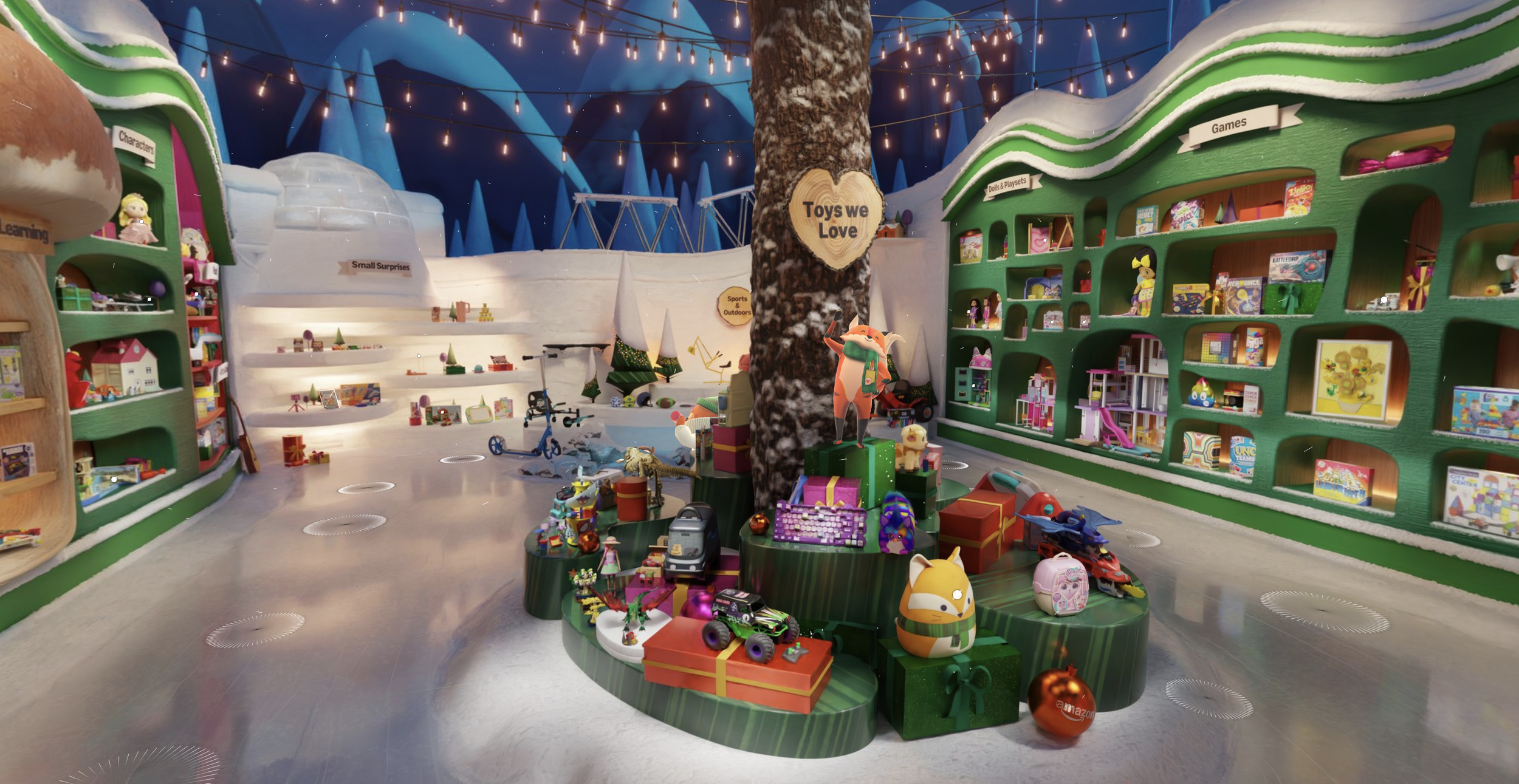
As we ramped up our modeling fidelity, we started creating spaces from scratch in 3D. These lean into whimsical, highly curated designs that couldn't exist in real life - but still tie in with the product selection.
In either case, rendering photoreal graphics on a web browser requires some tradeoffs, either in interactivity or photorealism. Making a fully interactive video game out of this would ostracize our non-gamer audience, and cartoony visuals would cheapen products. We needed this to be easy to use, but look amazing.
Photoreal visuals, and simple controls.
After quite a bit of prototyping, we landed on a good middle ground - rendering each space from a series of preset angles that you can hop between with simple point-and-click controls.
Best-in-class Smooth Motion
This section is pretty technical for a UX portfolio—but one I was deeply involved in curating, and one that is fundamental to the quality of our UX.
How do we smoothly move from point A to point B?
Beyond spaces rely on moving from one prerendered angle to another. Doing that without smooth transitions creates a jerky, disorienting motion that research showed was a deal‑breaker. I pushed hard for smooth transitions, even though it meant significantly more engineering effort—and I ultimately got the team on board.
To get that smooth, buttery 3D motion from A to B, we move through a 3D space and dynamically retexture it from each new vantage point, using a little technique called…
You may have seen street art that uses this technique – art is stretched along a surface so that from one exact perspective, it lines up and looks 3D.
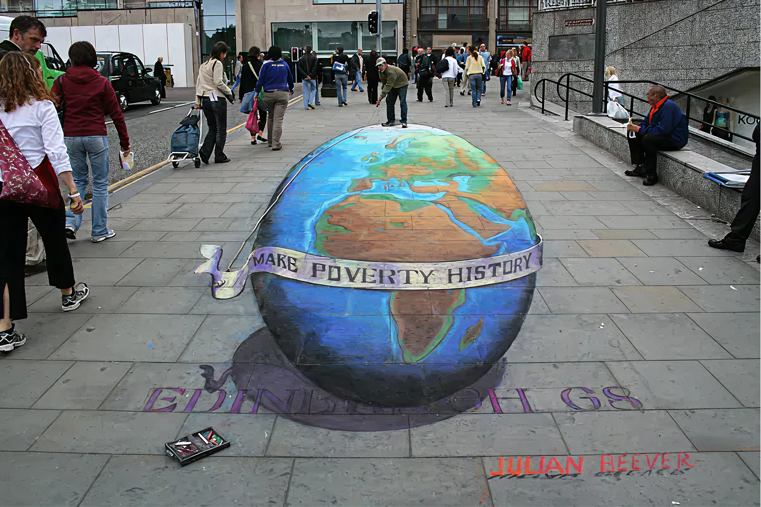
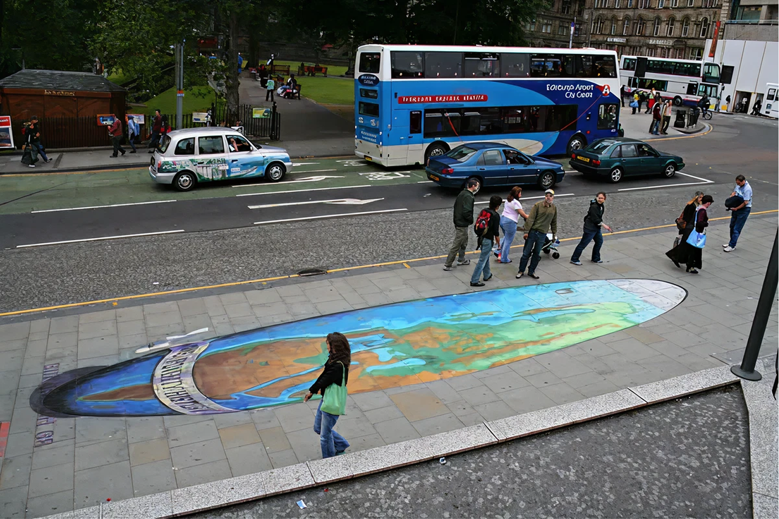
We do this same technique in Amazon Beyond to project a high-quality photosphere onto a simplified 3D model, so that it looks photoreal from your current perspective. This lets us load extremely realistic textures and lighting effects onto a full 3D environment from each perspective in milliseconds on a mobile phone.
The magic is in how we blend from Photosphere 1, projected from Position A, to Photosphere 2, projected from Position B as the camera moves through 3D space from A to B. This blending effect is what sells the feeling of movement with highly realistic details. It’s the result of a ton of fine tuning, animation curves, and some special trickery from extremely talented developers – call me biased, but it’s the best of any comparable experience out there.
If we didn’t get this working, no amount of clean UI or beautiful space design would overcome the hurdle of navigating through a space.
Creating these spaces in a 3D environment also let us add some lightweight 3D animations and effects into the scenes for an extra dash of delight!
Space Design Tenets
Here’s the UX guardrails I set in place for our interior designers and 3D artists to create and scan scenes that work best for Beyond.
Every product needs a good close-up.
I wanted every product we put in a space to have a great viewing angle in 3D - otherwise, what’s the point of being in a virtual space?
Most other experiences skimp out on rendering a bunch of viewing locations, which means you’re looking at products from across the room and fully relying on 2D images and details – it’s very frustrating. So I made sure that when we create spaces, we have enough photospheres that every product can be seen close-up. It really amplifies the immersion of each space.
This often meant rearranging items in real-life stores we would scan. Clothing racks packed tight are fine when you can pull a hanger off in person, but in a virtual viewer, they’re near impossible to select and view.

Bad: Non-viewable Products
These are packed way too tight to be viewable in Beyond.

Better: Products On Display
Products are viewable enough to be evaluated and pique interest.
The products are the hero - not the space.
It was a frequent temptation to make fantastical, whimsical, fun spaces without regard for the products inside them. Too often we would plan out a beautiful, delightful space, and then at the end, tack random products onto shelves. I had to be the bad guy many times and push us to design around the products from the beginning. The space serves the products. Otherwise, the shopping sucks and we’re just making neat video game worlds that don’t meet our customers’ needs.

Bad: Fun Space, But Not Meant for Shopping
Back to the bouncy house. Yes, it's a fun, whimsical space, but it just has random tech products tacked into a corner with an ambiguous "Top Products" sign. The space cheapens the products.

Bad: Low Quality Product Visuals
These are just flat product images—what's the point of being in an immersive space? If the products aren't realistic, it breaks users' trust in product quality. Products need to look stunning.

Better: Photorealistic Products in Natural Spaces
Our insanely talented 3D artists and interior designers put a ton of work into making products true to life. Realistic lighting, materials, and settings give views of products that you couldn't get from 2D silhouette images.
Context tells a story.
A big selling point of Beyond for our partner brands was the unique ability to communicate brand identity in a virtual space. Amazon struggles with this – it’s the “everything store”, but when search results are from a bunch of different brands, all with images on white backgrounds, everything looks the same. There’s a lot of brands that don’t work with Amazon because they can’t properly elevate their brand and products.
Shoppers want this too. Brand loyalty is real, and if we can introduce brands in Beyond in ways that tell their story within a walled garden of curated items from a trusted source, it’s a tremendous trust builder for customers. I pitched Beyond to many, many brands and we were able to onboard several brands that would have otherwise not sold their products on Amazon.


Elevated Brand Spaces
Thoughtfully curated spaces tell a brand's story and signal to customers that every product has been hand-picked for quality.
I often stressed the importance of showing products in their natural settings. Seeing a whole room full of cohesive products at once drives inspiration and bag building like nobody’s business. We scanned influencer homes, created outdoor camping spaces, built houses themed around IPs and brands – all opportunities to showcase items in sensible spaces that elevate them.


Inspirational Lifestyle Scenes
Products are in natural but elevated settings. Sets of curated products placed in their real-world settings makes each product look its best, giving you ideas you wouldn't find in a sea of search results with individual products.
You’re probably thinking:
“This is a UX portfolio…where’s the UI design?”
Yeah, yeah, it’s comin up next. But I strongly believe good UX encompasses every aspect of a project, that’s why all this is on here. If we don’t make beautiful spaces, if we include cheap products, if we don’t make smooth 3D navigation, if we don’t partner with good brands…it does not matter how nice the UI looks; people will bail. That’s why I was involved in every aspect of this project to ensure we were making every single decision with our customers’ needs in mind.
Alright, let’s talk UI.

INTERFACE DESIGN
Dots get a bit smaller over distance (but still tappable), and disappear/reappear at a distance from camera.

Dots
Dots indicate shoppable items. Without them, users don’t know what’s shoppable and what isn’t.
But too many dots can overwhelm a space and cover up products. After a LOT of variations and prototypes, we found a good middle ground between usability and minimalism by: (1) scaling dots loosely relative to camera distance, and (2) fading them out at far distances. This keeps the view clear while maintaining usability.
Out of Stock Dots
Products will inevitably go out of stock. But tapping a dot only to discover after the fact that you can’t buy the item was a session‑ender in research. People couldn’t trust the shoppability of any dot and didn’t want to have to tap each item just to see if it was buyable.
The team suggested removing dots for OOS items. I pushed back on that – if a prominent product in a space was dot-less, customers would assume the dot was hidden, broken, or missing for any number of reasons. That creates confusion, not clarity.
Instead, I proposed a distinct out‑of‑stock dot that signals the state upfront without drawing too much attention, and explored a range of visual treatments to get it right.
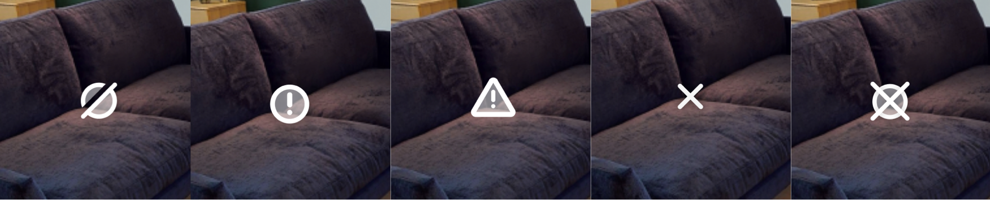
My goal was to create a visual that clearly signifies out of stock, is still tappable and visible, but can’t be more prominent than in-stock item dots (no big red error dots), otherwise people will be more drawn to bad products than good ones. I landed on a subtle yet recognizable slash, which was immediately recognizable in user testing, solving our issue.

Product Details
There’s a lot that’s new in Beyond. Too much “new” can be overwhelming and cause customers to bail. When we discussed product details, I wanted this to lean on familiar patterns Amazon customers know and love, without reinventing the wheel. But I had one key goal with product details:
Include enough shopping info that customers can find and buy a product in Beyond without leaving a space.
I would not allow us to build an experience where customers had to leave a Beyond space to learn more about a product, then have to re-enter Beyond if they didn’t like it – over and over again. This would be so tedious that customers just wouldn’t come back.
But we also didn’t want the full details page in here, with all its pivots that would leave a Beyond space, and different widgets that would command a full screen and interrupt the experience.
So, I did a breakdown of the entire Amazon details page, and grabbed all the relevant evaluation widgets for us to include. We had to completely re-make these elements from scratch since they weren’t designed to be plug-and-play, so I spent a significant amount of time faithfully reproducing every font size, spacing element, color, etc.
I also did quite a bit of manual CSS polish for this in our codebase to ensure these looked exactly right.

This was quite a bit of extra dev effort over a simple “View full details” egress button, but it was crucial for Beyond’s shoppability and session longevity. Now customers could learn all about products and make buying decisions without constantly exiting and re-entering a Beyond space.
I HATE forced tutorials. Built a lot of bad ones over the years. People skip‑skip‑skip because they’re impatient and think they can figure it out themselves, and then they get lost and bail. What works way better is progressively disclosed tooltips that let users try on their own first, and only nudges them when they’re stuck. It keeps them in control, never blocks the experience, and only appears when needed.
Only show tooltips when users need them.

Progressive Tutorials

Made that hand animation via keyframing a hand 3D model in Blender, you would not believe how much I had to stare at my hand to get that looking right
Map & Filter View
For customers on more targeted shopping missions, I needed a quick way to surface the right items. A simple top‑down map with filters lets people jump straight to what they care about, like a digital version of asking a store associate for help.
Beyond is mainly built for serendipitous discovery, but this gives customers utility at any point in their mission, which strongly boosted return use.
Tapping anywhere on the map moves you to the nearest spot, allowing for a better understanding of the layout of a space. This was particularly important for our larger scenes where customers could get lost or unknowingly miss large sections.
Platforms
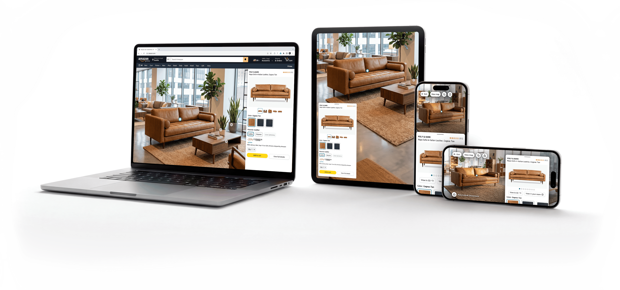
While immersive features like Beyond look best on larger screens, we needed to meet customers where they’re at—and a large majority of Amazon customers browse on mobile. To ensure a wide reach and a consistently immersive experience, we released Beyond on desktop, tablet, and mobile—in both portrait and landscape rotation.
And more!
A few of the additional UI components and features I made to support a holistic product launch.

Seller Partner Tooling for Annotating Spaces
I designed all our internal tooling for adding/editing dots, product info, starting views, and more.
Zone Labels
I designed optional floating labels for spaces, to help with wayfinding in areas without in-store signage.

Landing Page
I created a landing page customers can get to from any showroom to discover more Beyond spaces. This is frequently updated with promos for seasonal, trending, and event-based spaces. I learned some internal tooling to launch this page to prod with zero dev help.
"Next View" Rocker
I designed an easy way to quickly see the highlights of a space by cycling through a set of curated viewpoints.
Microdots
As we improved our 3D model fidelity, we were able to make the whole product its own tap hitbox, rather than its dot. So now we just needed dots as a shoppability indicator, which led me to a much smaller design that gently pulses to grab attention without covering up products.

Data Visualization & Artwork
A passion project visualizing color palettes in films that became a widely adopted pattern.
Rendering Photoreal Products
A deep dive I took into the technical deets to overhaul the realism of all 3D products on Amazon.


AI & Conversational UI in Augmented Reality
Overhauling Amazon's View in Your Room feature with spatial AI and natural language UI.

VR Northstar Design
A high-fidelity VR home shopping interactive demo I spearheaded design on.

Accessibility & Physical Prototyping
A functional Braille communication prototype i built from scratch for visually impaired gamers.